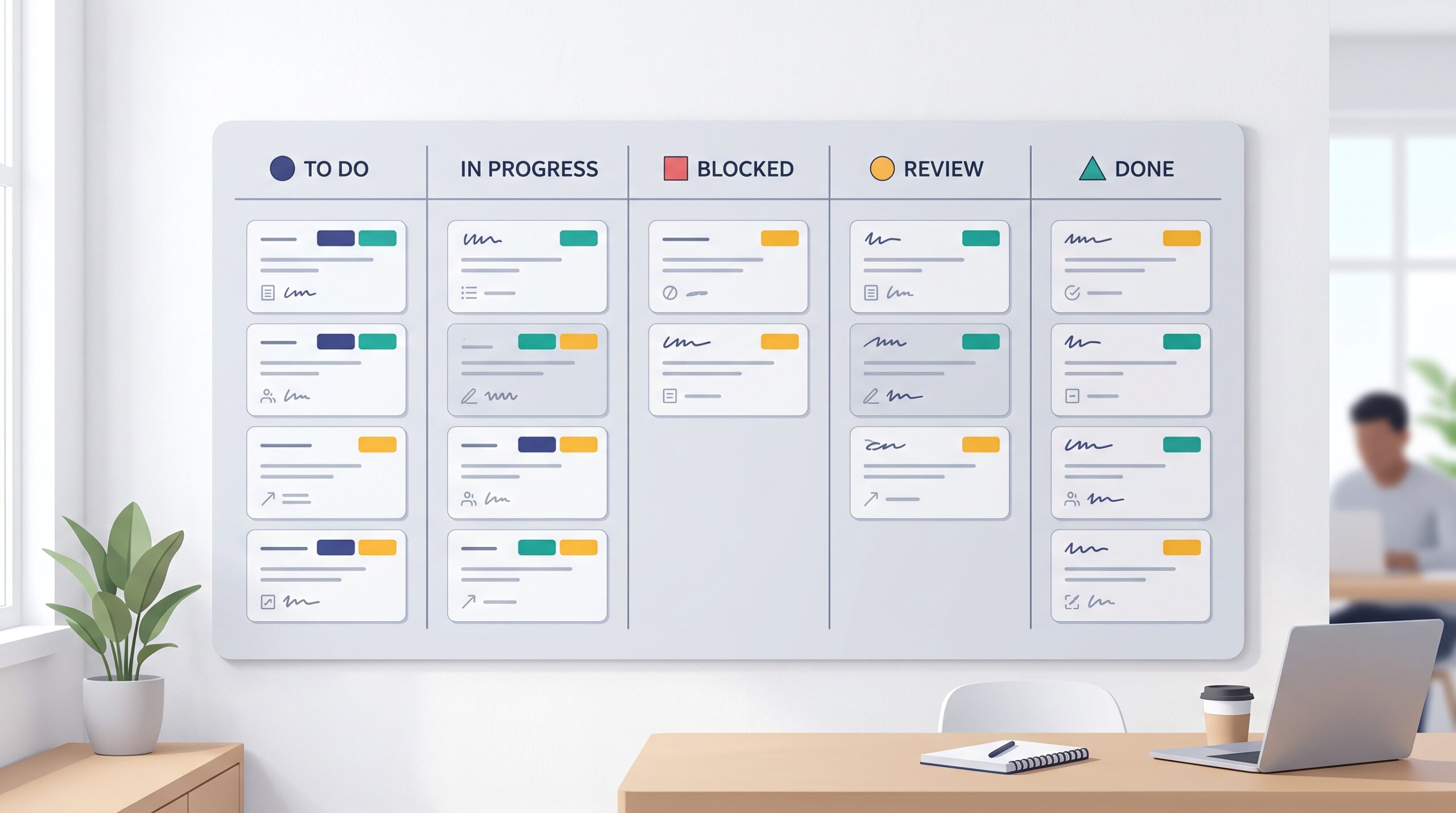
Open a brand-new kanban board and the labels look irresistible. A dozen bright colors, one click each, and suddenly every card is wearing three or four little tags. It feels organized. Then a few weeks pass, nobody remembers what lime green was supposed to mean, and your board looks less like a workflow and more like a bag of confetti spilled across the screen.
Labels are one of the most powerful features on any board — and one of the easiest to ruin. Done well, they let you read the whole board in a single glance. Done badly, they add noise you have to decode every time. The difference isn’t the tool. It’s restraint and a little bit of planning.
Decide what a label is actually for
Before you pick a single color, answer one question: what do I want to know the instant I look at this board? That answer is the only thing your labels should encode. Not five things. One.
For most small teams, the honest answer is one of these: which kind of work a card is (design, admin, sales), who or what it belongs to (a client, a project), or how urgent it is. Pick the single dimension that would save you the most time if you could see it without reading a word — and build your colors around that. Everything else can live in the card title, a due date, or an assignee, where it already belongs.
Fewer colors, more meaning
The magic number is three to five. Past that, your brain stops recognizing colors instantly and starts translating them, which is exactly the work labels are supposed to save you. Seven near-identical shades of blue are not a system; they’re a memory test you’ll fail every Monday.
Reserve your loudest, warmest color — a strong amber or red — for the thing that genuinely needs to jump off the screen, like urgent or blocked. Use calmer colors for the everyday categories. If half your cards are wearing the “urgent” color, it isn’t urgent anymore; it’s just the background. Scarcity is what gives a color its punch.
Write the meaning down where everyone can see it
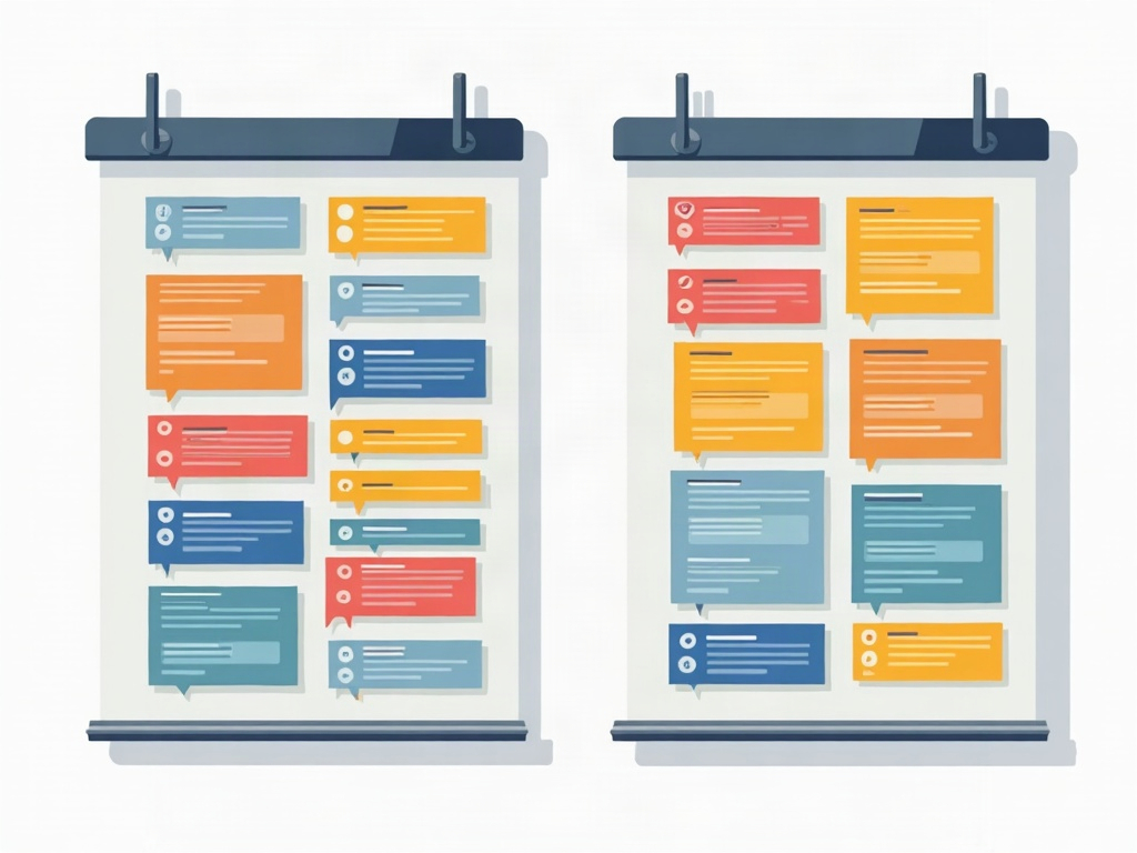
A color scheme that lives only in your head is a scheme that dies the moment a teammate joins or you take a week off. Give every label a plain, obvious name — “Client work,” “Needs review,” “Urgent” — not a bare color swatch. Then keep a one-line legend somewhere visible: pinned to the top of the board, in a card in the first column, or in your team’s notes.
The test is simple: a new person should be able to understand your colors in ten seconds without asking anyone. If they can’t, the scheme is too clever. Boring and obvious beats clever and forgotten every time.
Let the color do a job, not decorate
A label earns its place only if it changes what you do. “Needs review” is useful because it tells the reviewer where to look. “Urgent” is useful because it reorders your day. But a label that just restates the column the card is already in, or repeats the assignee’s face right next to it, is pure decoration — visual clutter dressed up as organization.
Here’s a quick way to audit: point at a label and ask, “If I removed this, would anyone lose information they can’t get another way?” If the answer is no, retire it. Most boards can lose half their labels and read better for it.
Use labels to filter, not just to color
The real payoff of a tidy label scheme shows up when you filter. On most boards — KanbanBlocks included — you can hide everything except one color. Suddenly you can pull up just the client’s cards for a status call, just the urgent work for a Monday triage, or just the “waiting on someone else” items to chase down.
That’s when consistent labels stop being decoration and start being a lens. But filtering only works if the labels are applied honestly and every time. One forgotten tag and a card quietly disappears from the view you’re trusting — so a small, disciplined set of labels beats a big, half-applied one, always.
Review your colors like anything else on the board
Label schemes drift. New categories creep in, someone invents a color for a one-off project and never removes it, and slowly the confetti returns. Once a month, spend five minutes on the legend itself: merge colors that overlap, delete the ones nobody uses, and rename anything that’s gotten fuzzy. Treat the scheme as living infrastructure, not a decision you made once.
The goal never changes. You want to glance at the board and instantly know the one thing that matters most — no decoding, no guessing, no archaeology. Get that right and a handful of well-chosen colors will quietly do more work than a rainbow ever could.
The short version
Pick one thing your colors should tell you. Keep it to three to five labels, with your loudest color saved for what’s truly urgent. Name them in plain words, write the legend where everyone can see it, and cull anything that’s just decoration. Then use those colors to filter, and revisit the scheme monthly so it stays honest.
Labels aren’t about making your board pretty. They’re about making it readable in a glance — and a simple kanban board with a disciplined handful of colors will always beat a beautiful mess.